


Description:
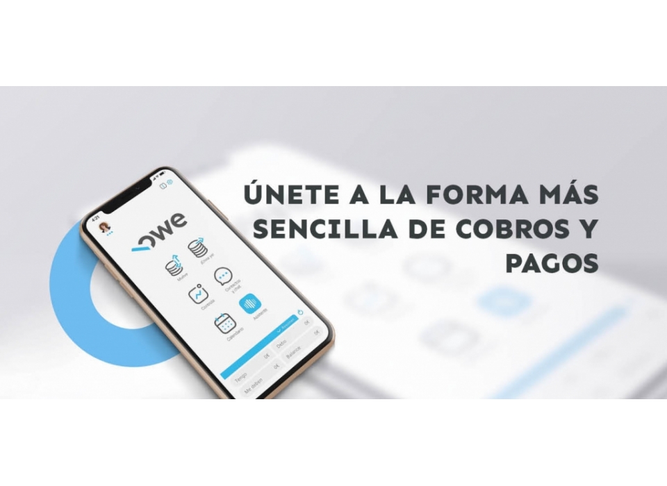
Owe is a digital platform that automates bills and payments with the aim of solving incidents, arrears and non-payments at both user and company level, providing greater productivity and leaving uncomfortable processes behind.
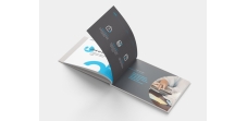
Prodigia has worked with the client from the beginning to end, from an initial consultancy phase to a more strategic one that is embodied in its new corporate identity.
Development:
The Isologo is based on Sen typography with a simple and friendly appearance. For its design we have customized the "E", softening its finish. To homogenise the "W" with the other letters that have curvature, we have softened the upper central peak, and finally the "O" has been completely customized as the image and concept of the brand. Our reference is technology and SIMPLICITY. With these two references we took the concept of the smartphone uses and the main characteristic of Owe, collection and payment with a simple gesture. Taking part of the O as a finger and adding an inclined straight line, we simulate in an iconic way, and as simple as possible, a finger tapping on the mobile screen seen from the side.
The traking is very well balanced. Lower case letters have been used to give it more personality and not to confuse it with acronyms.
Result:
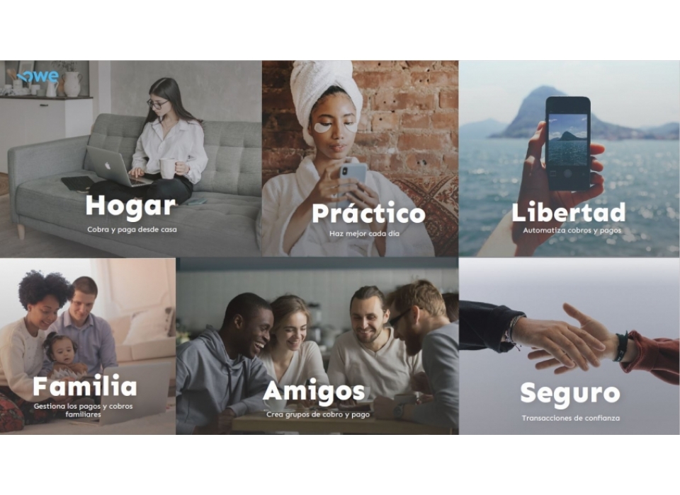
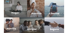
Owe's new identity is based on trust and the immediacy of technologies. Other attributes such as innovation, simplicity and proximity have also been used to create a visual identity that has been very well accepted by the whole team and which is open to growth through innovation.