


Description:
Manufacturer, distributor and direct sale of furniture. Web and campaign SEM also made by Prodigia.
Goals:
-
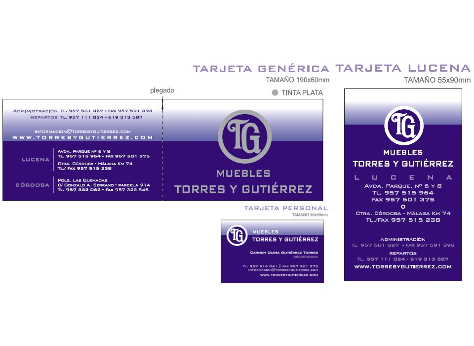
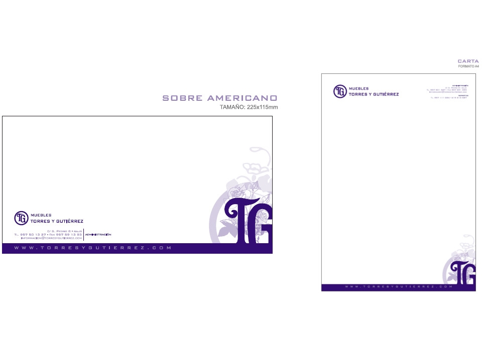
Complete corporate identity manual.
-
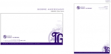
Design of stationery with 3 business card formats.
-
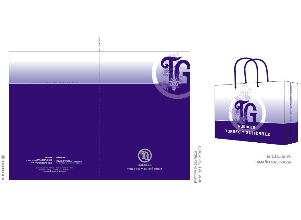
Design of rate folders.
-
Design of offers displays.
-
Large label design and small label, on both sides.
-
Gift paper design.
-
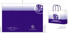
Design of cardboard bag.
-
Order sheet design.
-
Budget sheet design.
-
Design of receipts
-
Delivery note design.
-
Invoice design
-
Design of adhesive label for parcel shipments.
-
Billboard design.
Results:
-
Complete and exhaustive manual of corporate identity, contemplating all the elements gathered in the briefing.
-
Symbol: the symbol is formed by the abbreviations of the name of the company, the letters "T" and "G", enclosed in a circle. The letters are located at different heights and very close, which gives it character and continuity. The type of drama chosen for both can be called classical and gothic, with rounded shapes and filigree, that enrich the form of the letter and turn it into a graphic symbol. The letters are placed in the center of the circle that surrounds them, to a size a little smaller than this one and thus being at a minimum distance from the edge. The circle has a thickness similar to the thickness of the typography (note the width of the letter "T" in its central part) which makes that some forms complement each other and relate to each other.
Together, the symbol denotes a brand with strength and rotundity, framed within a classic and enduring style, easily readable and strongly related to the name of the brand.
-
Logo: the textual part of the corporate image, the logo, made up of "Muebles Torres y Gutiérrez", uses a more current and innovative typeface, with uppercase characters, characterized by straight strokes, of square height, which contrasts and complements the curved shapes of the circle. It differs in two parts that contain the words "furniture" and "Torres y Gutiérrez", with the first word being smaller.
The typeface chosen for the logo is called Bank Gothic Medium. It will always be used in the corporate colors of the brand and like the symbol, the tones can not vary between both parties. The Bank Gothic Light variant can also be used for stationery, signs, posters, etc. For other uses you can use a complementary font, the so-called Arial, for printed at internal levels, content of letters, manuals, etc.
The logo can be used in two different versions, a main one in which the words "furniture" and "Torres y Gutiérrez" are aligned in the center, and another secondary, for the horizontal version of the brand, in which both parts of the logo they are aligned to the left.
-
Brand: The corporate image designed for "Muebles Torres y Gutiérrez" is based on the affirmation of the identity, the name of it, framing the acronyms so that it is remembered and retained better, leaving both parts of the brand, symbol and logo, clearly related.
It is an image easy to remember, emphatic, elegant and classic. It uses a single ink for all its forms, which makes its readability and clarity easier, and simplifies its composition in this way.
The typeface used for the symbol is a special typeface, modified for the brand, thus associated with a unique character.
The color chosen for the brand is Pantone 273 C, which will always be used in any reproduction of it. For special reproductions, you can use Silver Ink for the brand, and the blue flat ink chosen for other graphic elements.
The corporate colors described here will always be used. For black and white versions of the brand, black or different gray wefts will be used, always choosing wefts above 10% black.