


Description:
Farmaciaonline365 contacted us to improve their website and brand in search of a differentiation of the sector and an improvement in user experience. Pharmacy whose priority is customer service, giving a professional and a closer treatment offering a wide range of products and brands both pharmacy and parapharmacy, with advice.
Objectives:
To design a distinctive area brand . Fresh concept, close, natural and trending brand.
Results:
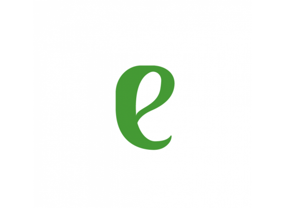
MentaFarma, has a sensorial and differentiating naming that will also allow us to reinforce it in the future with sensorial marketing in its shipments. We have used two thick stick typographies for the logo, reinforced with the combination of lowercase and uppercase letters to facilitate visual reading. The E has been personalised with small shades representing a small mint bud.
Finally, for the corporate palette we have used a range of greens. A dark green and a more saturated green for the main icon, giving it more prominence.