


Description:
Consultant specializing in logistics facilities projects for companies from different sectors. Optimization of logistics processes and human resources in storage systems through automation. International field with headquarters in Granada.
Goals:
-
Naming and brand creation.
-
Development of corporate identity that transmits the essence of the brand and the type of activities of the company, differentiated from transport logistics.
Results:
-
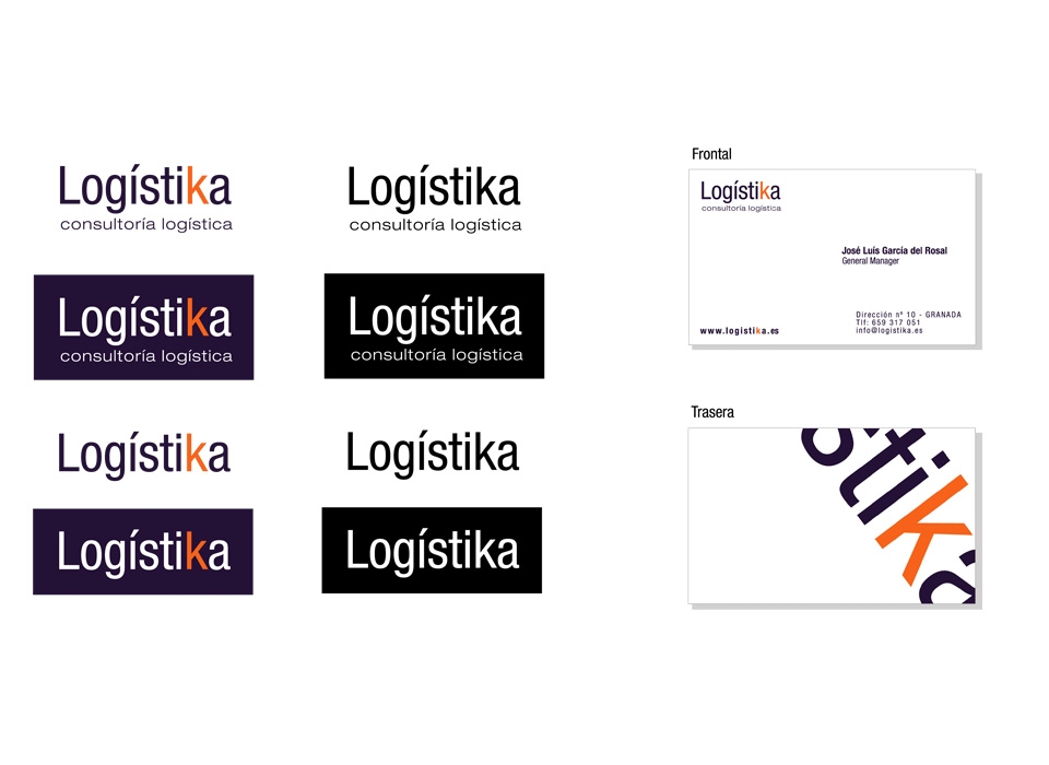
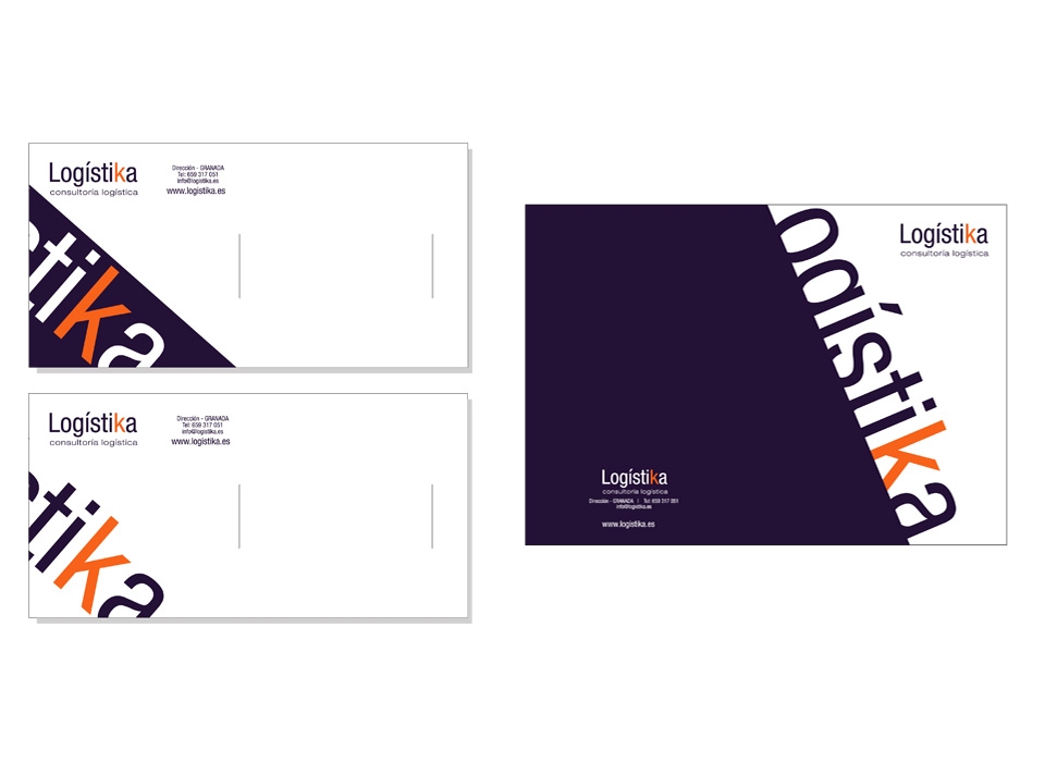
Justification of Logo:
The logo is in itself one of the most important parts of the brand, since it houses the very name of the company by which it will be known; On the other hand, being a direct and explicit brand name, you do not need any symbol to accompany it; enough reason to give maximum importance to typography and corporate colors.
Taking into account that the name of the brand is direct, that is to say, name and activity of the company are united, we have opted for a typography that denotes simplicity; neither too straight, nor too curved. A typography that transmits consolidation and wisdom (know-how), but at the same time modernity and avant-garde.
The clear reading of the typography at first sight, does not require distraction with other elements or symbols, which constitutes an easy to remember logo. The logo is accompanied by a descriptive text of the activity, which is presented with a typography of the same family as that used in the logo, but more stylized and thin, thus facilitating the identification of the name.
-
Justification of the brand:
The brand designed for the company "LOGÍSTIKA" symbolizes the main ideas that desan express, as simplicity, quality, modernity and confidence. Substituting the letter "C" for the "K" of logistic, denotes an intention to differentiate from the rest, so it has been chosen to use a second color in the "K".
Combined in the brand we see the colors purple and orange. Purple is used for much of the brand, while orange is only used in the "K". This second color offers a strong contrast that gives greater prominence to the "K".
-
Color psychology:
Purple: Color culturally associated with royalty and power, due to its prestigious historical past because of the difficulty of obtaining the dye necessary to create it.
For these historical reasons, it is a color that evokes wealth, even elitism. But the reason why we have chosen this color, is because it is the least used in existing brands, thus contributing to the simplicity of our brand, strength, prestige and clear identification.
Orange: Very active and energetic color, stimulating happiness and representative of dawn, enthusiasm and creativity. It is a color that reduces corporate formalism, which is why it has been used by Orange and Cingular (USA). Stimulant of metabolism and appetite. The reason that has led us to choose it as a corporate color is the energy that subtly prints the logo, as well as creativity.
Both colors complement each other, being the purple a dark color and the orange much more luminous, providing a clearly identifying combination to the brand.
The whole of the brand is a reflection of the ideas that they wish to communicate, there being no clearer way to define it.