


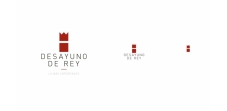
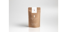

Desayuno de Rey is a nationwide human resources consultancy that offers to improve results and increase the productivity of the company. Optimising breakfast time motivates and improves the productivity of employees. That is why we offer themed deluxe breakfasts to SMEs and large companies. This way we make the employee perceive this incentive as a higher value than the real one, as feeling like a king, appreciated, entertained and valued is a great motivating incentive.
Concept:
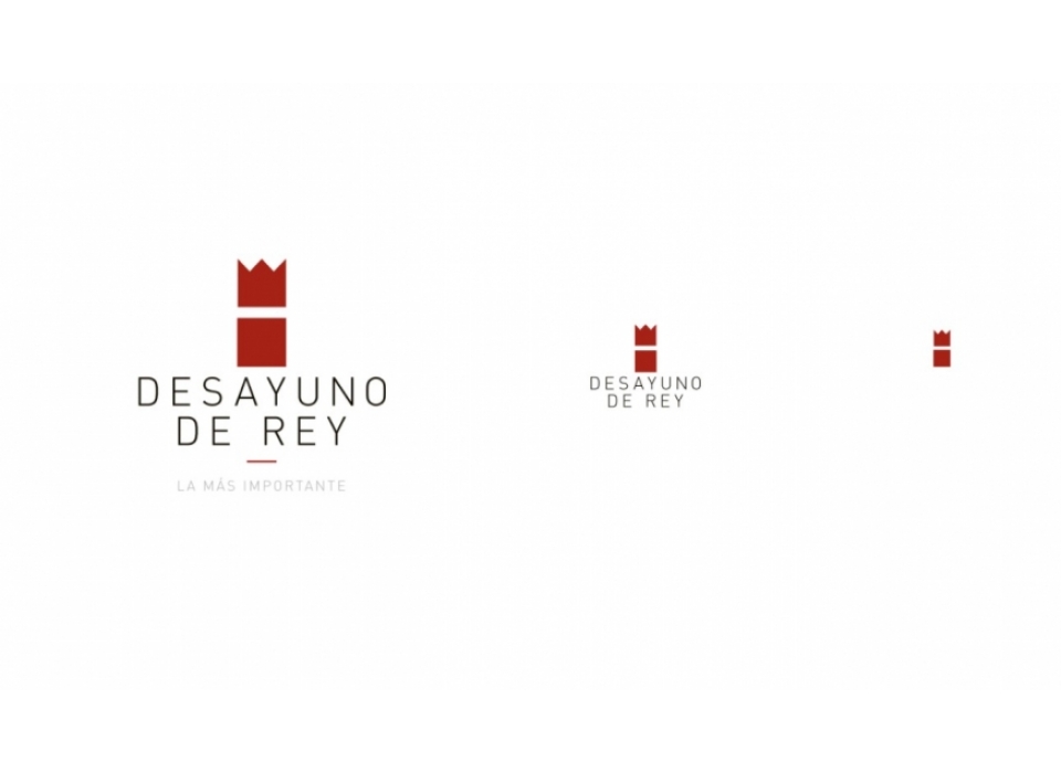
This is an imagotype consisting of a symbol, representing royalty, and a box, containing the experiences and sensations of King's Breakfast, the naming, its textual part.
Typography:
Two typefaces will be used. On the one hand, Butler, a serif typeface created by Fabian De Smet. Based on the Dala Floda and Bodoni, it gives a distinguished, elegant, personal look with great visual impact. Secondly, we will use Raleway, a very clean and balanced sans-serif, legible and minimalist. The combination of the two gives contrast, personality and elegance. Giving our texts a greater visual impact.
Colour:
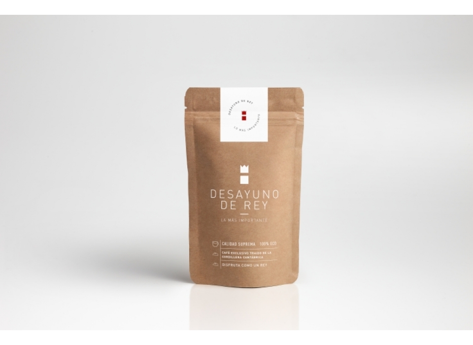
Red because it denotes attraction and passion, for quality, for enjoying small pleasures and for things made with love.
Black is a contrasting colour and gives authority to the naming.
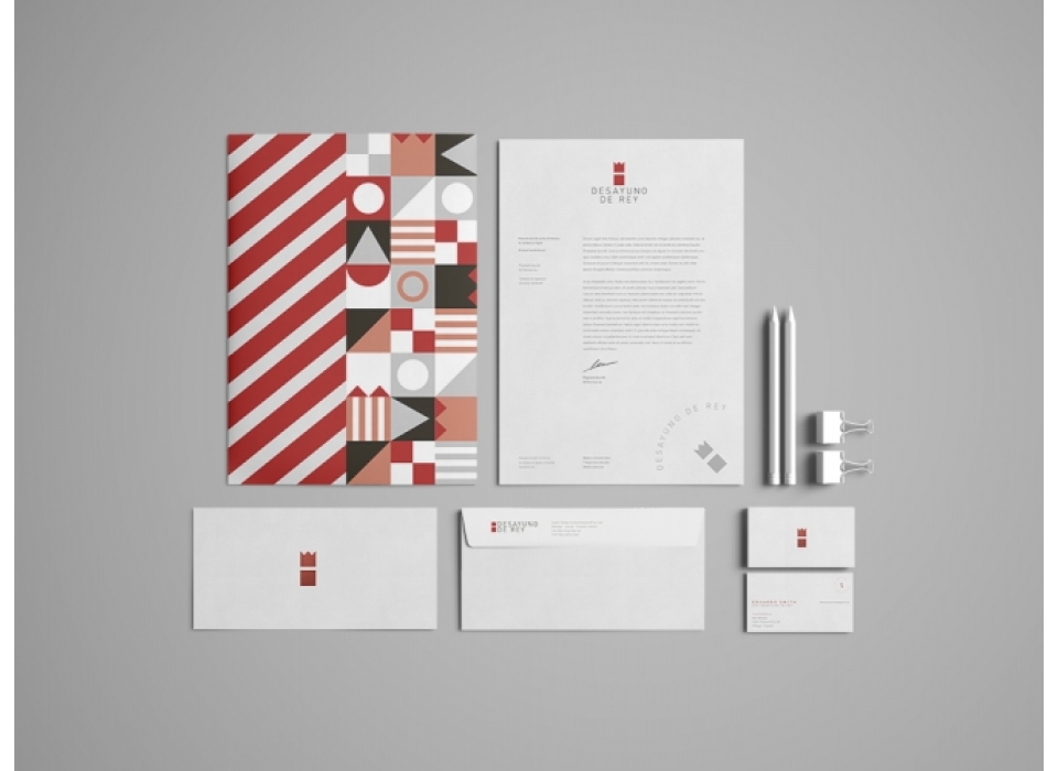
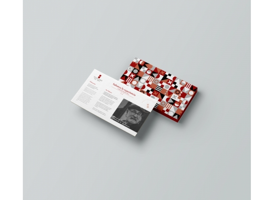
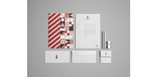
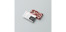
To give more coherence to the concept of royalty, we have complimented the logo with its own royal standards. Desayuno de Rey has its own pattern, which will be the emblem of its dynasty.