


Buylooping is an e-commerce project for food products whose objective is to introduce this market system in digital distribution channels, making the whole purchasing process faster, simpler and more fun for the user. The main strategy of the brand is loyalty through the concept of subscription or regular purchase. The user, when buying products from the supermarket, chooses how often (the periodicity), creates a loop for repeated purchases. A loop is a subscription, of one or several products, to periodic purchase using gamification, thus making shopping a fun process.
Development:
We are dealing with a conceptual brand, which has an implicit call to action. The brand is highly retentive, thanks to its graphic story telling: shopping is fun by looping.
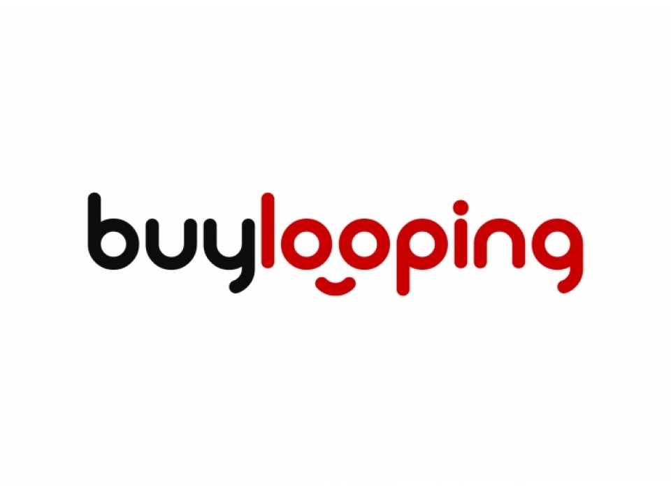
The logotype consists of a word mark in lowercase letters in which a thick, rounded sans-serif typeface has been used. Below the "O" is a small arc that forms a smile. A friendly and fun icon that conveys a feeling of confidence and happiness to the user.
The colour palette combines red and black differentiating the two concepts and emphasising the gesture of the symbol.
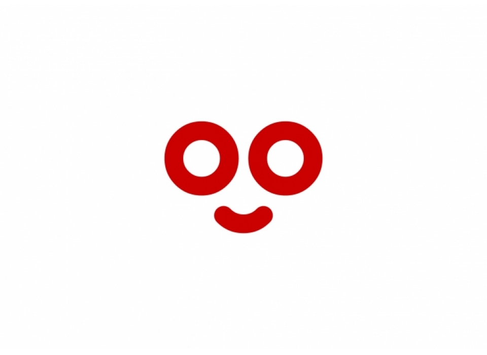
The brand works perfectly at all sizes, but due to its horizontal extension, for small spaces, the symbol "smile/looping" will be used.
The logo is simple, friendly and timeless with a professional and confident character.