


Description:
Rural accommodation in the subbética cordobesa.
Goals:
-
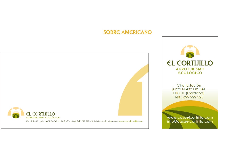
Corporate identity manual.
-
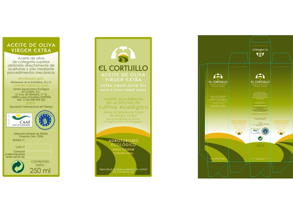
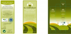
Packaging design for oil bottle of the olive farm where the farmhouse is located, and sold in the same accommodation.
Results:
-
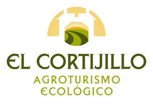
Symbol: the graphic part of the corporate image, represents the silhouette of the accommodation, cortijo, through which you can see an olive field illuminated by the sunrise. The symbol is formed by a set of shapes that combine curved and straight lines in an elegant, symmetrical and sophisticated way. There is a large semicircle on which a silhouette of straight shapes is outlined, simulating the contour of the rural accommodation, and within it, at the same time, another space is opened through which you can see curved shapes superimposed on each other, representing a landscape, field of olive trees, with the sun in the background.
The curved shapes of the ensemble contromo, resemble the time to the contour of a fan, objetio typical of the area, and gives a fresher and dynamic style, clearly reminding the southern culture. The symbol invites you to pass and observe, to enter the farmhouse and surround yourself with nature and wellbeing
-
Logo: The textual part of the corporate image, the logo, composed by "El Cortijillo", uses a typography that can be called classic, with uppercase characters, characterized by curved and straight strokes, of square height, that easily combines with the forms of the symbol. The logo uses the darker olive green color, which makes it highly visible and easy to read. To use the image in the respective products of the company, a secondary text will be used with the activity, with the same typography and located below the main mark, and the brightest green color.
-
Brand: The corporate image designed for "El Cortijillo", rural accommodation and production of extra virgin olive oil, represents the main ideas you want to express, such as nature, tranquility, well-being, calm, rest ...
Composed by symbol and logo, it uses in both parts colors that resemble those that can be found in the rural environment of the accommodation, these are olive green and golden tones. The chosen chromatic range is reminiscent of the olive groves of the southern lands, of the Subbética Cordobesa, and the golden light of the warm atmosphere that is enjoyed in the area.
The composition of the image is based on arcs and curved shapes, which overlap one another, with straight line cuts, on the textual part that is compacted vertically.
It is an image easy to remember, impressive and of great elegance and modernity. Remember real and symbolic images, so it is easier to visualize and retentive.
-
Packaging: An elegant cardboard packaging has been designed for the bottle, as well as its labels. According to the identity manual, they give the product distinction and quality.