


INSTRUCTIONS
Experta is a Spanish DMC (Destination Management Company) agency.
Objective: brand positioning in sustainability and marketing.
VISUAL IDENTITY
Experta, an agency as its name suggests, an expert in event management based on sustainability.
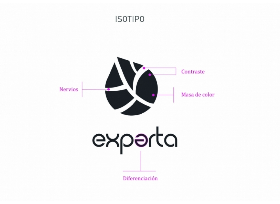
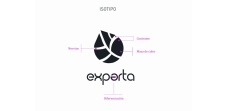
Visual identity is born from the sum of naming with its value proposition: experience and sustainability. For the sustainable concept, an isotype with a lot of color and retentive mass has been designed. A personalized leaf whose characteristics are its shape and the internal lines that form the nerves, or also called, the veins of the leaves.
As the main concept is explicitly represented in the imagotype, the color is worked to convey the rest of the attributes such as expertise and confidence, which we will talk about later. Finally, the second E has been modified to add a differential touch and facilitate the use of the isotype and the text separately without both losing their identity.
COLORS
Colors decisively influence our perception of reality. They have the power to convey a message and emotions. Like that meaning, it can vary depending on the color with which it is combined.
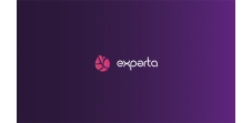
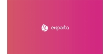
For Experta, a purple color has been chosen.
In history, purple has been associated with royalty for its difficult production and high cost, which was a mark of power. If you focus psychologically, it is the color that balances red and blue. Red tends to give you intensity and energy while blue gives you calm and stability. Together they create the purple color that is the perfect balance between the two. In addition, it reflects creativity, imagination, wisdom ... It conveys prosperity. It is usually used in the world of events and the night.
Pink (in its pink hue), as a complement, brings a touch of warm light and energy. It has a calming effect and transmits confidence, friendship, sophistication ...
The other two shades that combine with pink and purple create a more preserved balance so that it is not so saturated.
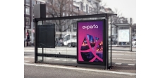
In short, a bold color that describes its own naming. And that stands out from its competition by adding an innovative character.
TYPOGRAPHY
The typography also communicates and must be related to the imagotype. In the case of Experta, vertices should be avoided, due to their circular construction, and they should have an average weight that compensates for the color mass of the imagotype.
Cappadocia Font Regular composes the textual part of the logo. This typeface presents a Sans Serif style (without serifs) that makes it clear, simple and with a straight finish providing a minimalist touch. There are no decorative elements to distract the eye, making it very good readability.
The curvature connects perfectly with the isotype, generating a complete balance between the two.
Its characteristic finish, accentuated by the twist of the second E, allows us to even use it without the isotype.
In short, we have a current, safe and presence typography.