


Description:
Adult entertainment company, which offers live video conferencing with operators, through a telephone payment system and a banking gateway with a credit card.
Goals:
- Naming
- Corporate identity, that transmits seriousness, entity, quality.
Results:
Naming: Name of easy readability and retentive, related to the activity.
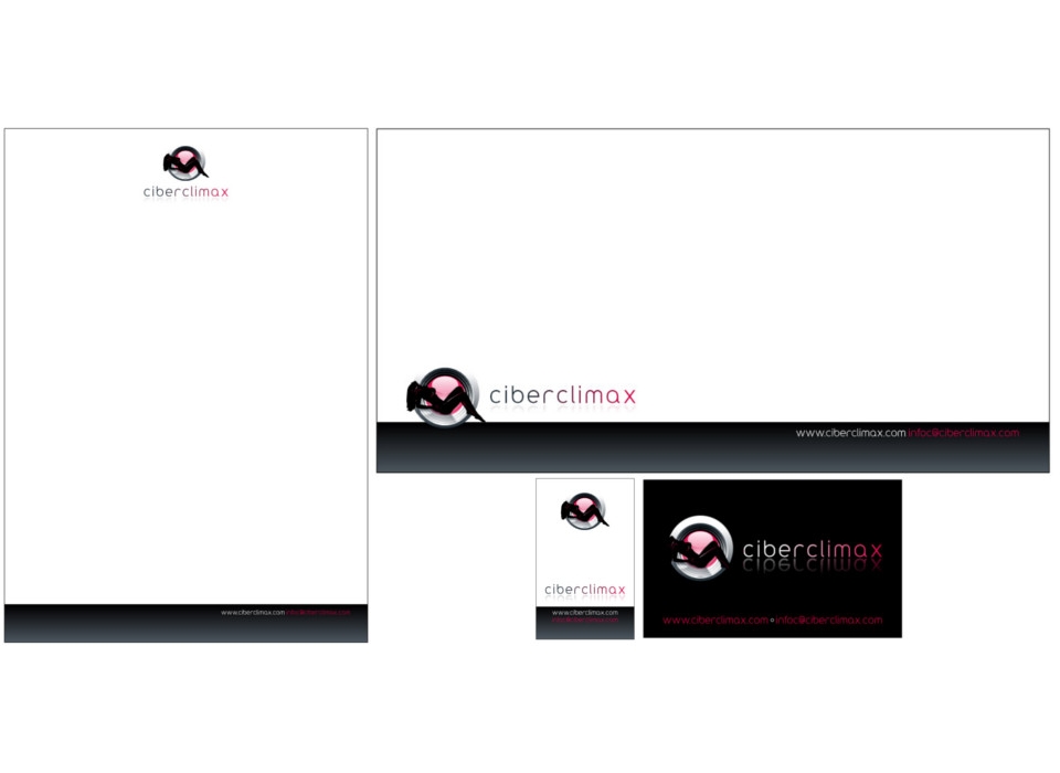
Corporate identity composed of a symbol and logo.
-
Symbol: formed by two elements that represent a recumbent female silhouette and the objective of a webcam behind it. It combines the colors black, gray and red, in an elegant and sensual way, creating effects of lights and shadows.
The female figure reclining on the background that represents the objective of a webcam, denotes sensuality, eroticism and beauty, in the forms and pose. In black, stands out on the colors of the background creating contrast and attention. With light effects in red and white, a subtle effect of volume is created.
The circular shapes of the background, in the corporate colors, represent the objective of a webcam with effects of brightness and shadows, framing and highlighting the female figure even more. The symbol as a whole symbolizes the main ideas of the company and its activity, observing through the webcam, with seriousness, quality and innovation.
-
Logo: the textual part of the corporate image, the logo, made up of the name of the brand "cyberclimax", uses a typeface that can be called modern and modern, with lowercase characters, characterized by curved strokes, of square height, which combines easily with the forms of the symbol.
The highly legible logo uses the corporate colors red and gray. A reflex effect has been created below the text, which gives it elegance, mystery and quality, so that it combines with the effects of lights and shadows created in the symbol.
-
Brand: The corporate image designed for "cyberclimax", represents the main ideas that you want to express, such as eroticism, sensuality, quality, innovation, seriousness ...
The composition of the image is based on curved and circular shapes, both in the symbol and in the logo, reinforcing the lines of the feminine form.
It is an image easy to remember, shocking and current. Remember real and symbolic images, so it is easier to visualize.
-
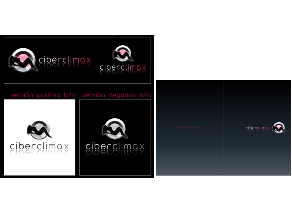
Colors: the brand combines the colors red, gray and black. The chromatic range chosen recalls and resembles colors related to the world of night, sensuality, eroticism, women ...
The corporate colors described in the identity manual will always be used. For black and white versions of the brand, different gray patterns will be used, always choosing frames above 10% black and respecting the configuration of the frames used in the color version.