


Description:
Company producer and marketer of extra virgin olive oil. Oriented to export with a product of the highest quality.
Goals:
-
Creation of naming.
-
Corporate identity design
-
Design of a corporate identity manual.
-
Transmit a gourmet product of excellent quality, to sell in the highest ranges of olive oil in European countries.
Results:
-
Naming according to the target, with auditory retentive, sinuous sound and focused on the international market.
-
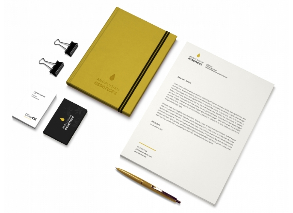
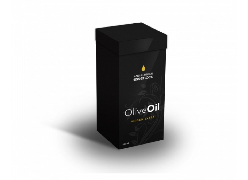
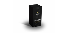
Corporate image of high visual impact, elegant, minimalist, differentiating in the sector.
-
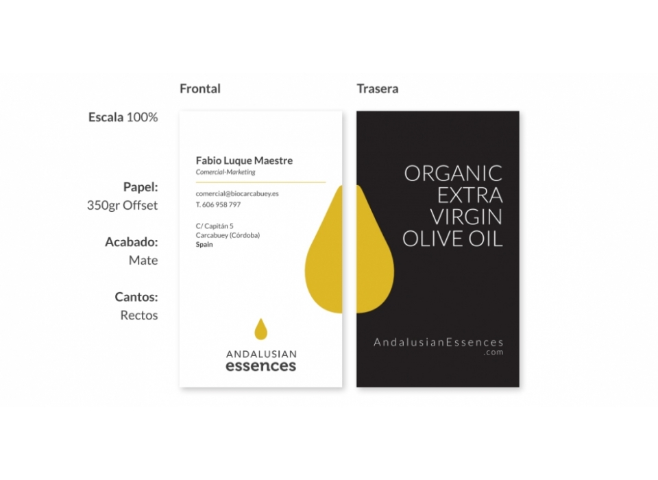
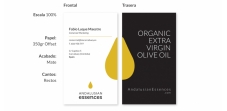
Symbol: Inspired by the value that the product contains in a simple drop, it represents the essence.
-
Brand: It is a minimalist identity in concept and with a few simple elements manages to communicate the type of product that accompanies it. The objective is to bring simplicity, sophistication and elegance to the product. In general, the lines are smooth, at the end of the typographies that form straight lines. The name of the brand is composed of several graphically differentiated words to help your individual reading. This facilitates the visibility of the set and its visual retentiveness.
-
Corporate colors: Essentially, the chosen color refers to the color of the product (yellow). Black is the base color of identity and is used in most applications. On the other hand, the combination of these colors guarantees a good contrast, except for combinations of yellow and white in texts or elements of reduced size. The grays are complementary to the brand and can be used for compositions on white or black.