


Description:
Brand for beauty centers.
Goals:
-
Naming
-
Redesign of corporate identity, including luminous, reservation cards ...
Results:
-
Naming: NEKA.
-
Corporate Identity: For this brand, figurative minimalist forms have been used as a symbol. Under the logo has been placed a perspective silhouette of a semicircle, but playing with the thickness to give more graphic game and increase the sense of perspective, simulating a kind of broad bowl. On the logo stands a curved and thin shape that stretches upward and reminiscent of a flame. Symbolically the flame transmits peace and tranquility, it is the relaxed atmosphere that we look for when we use them, and it is the environment that we want to transmit to the client. A wenge tone has been used for the bowl as a sign of distinction and class, in addition, it is a color very used in the modern minimalism of decoration. The flame, by allusion and logic, has a light orange tone, creating a striking contrast between the vividness and dynamism of the orange and the seriousness and class of the wenge.
-
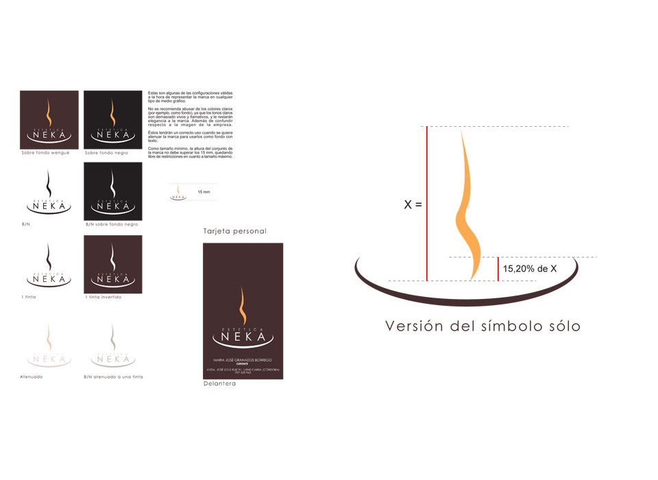
Colors: The colors used are Pantone Black 5 C for wenge tone and Pantone 150 C for orange. The height between the flame and the bowl should always be 21.8% with respect to the size of the flame. In case of using the symbol alone, so that there is not so much blank space and lengthen the composition of it too much, the graphic element of the flame will be lowered by 15, 2% with respect to the size of the flame from the maximum height of the bowl .
-
Typographies: The chosen font is Century Gothic, characteristic for being very thin and minimalist, as well as the use of the wenge tone in the lyrics, all oriented to follow with the same aesthetic line as the symbol. We believe that it is the most successful in the case of this brand if we take into account the concepts that are being sought to transmit. The space between letters has been adjusted to match the width of "aesthetics" and "Neka", so it is more even and the composition is not out of line.
-
Brand: As a result we have a very elegant brand, the wenge tone together with the stylized and thin forms of the symbol and the source transmit an idea of modernity, class, elegance and distinction. This sobriety is contrasted by the orange of the flame, obtaining a very attractive counterpoint. At the same time, the concept of sailing gives us feelings of tranquility and calmness, of the well-being that we can find when visiting the center. Elegance, class and well-being, the ideal concepts for an aesthetic center that wants to stand out from the rest of the market.