


Description:
Tour operator and exclusive travel agency for Singles (people without a partner). Web, CRM, Marketing Plan, and Social Media Plan also made by Prodigia.
Goals:
- Naming
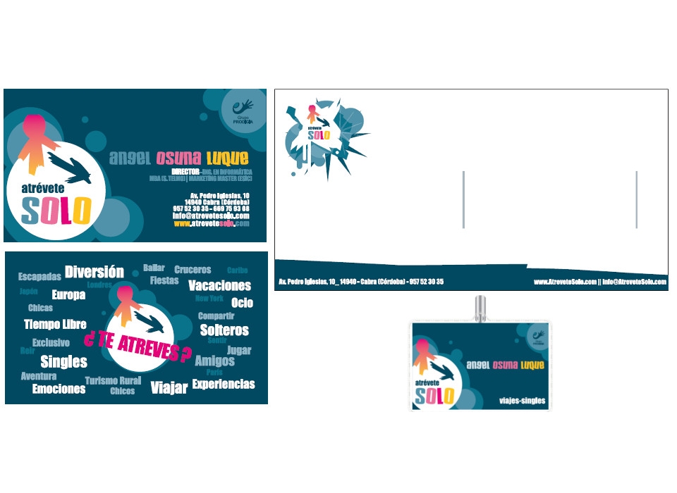
- Corporate identity manual.
- Banner 1.80 x 0.8 meters for meeting points.
- Flag for meeting points.
- Gift check
- Diplomas to deliver daring on trips.
- Accreditations
- Design of creatives for publications on social networks.
- Creatives for Facebook landing pages, cover of Twitter and FourSquare.
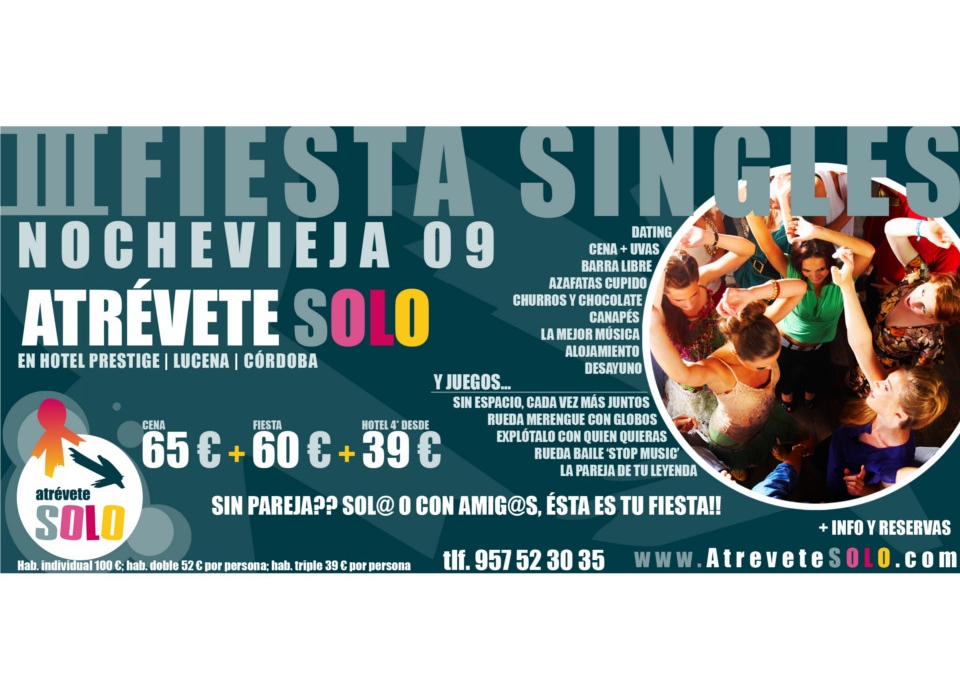
- Design of posters and flyers for New Year's Eve parties.
- Design promotions in social networks.
- Stickers and labels for trips.
- Christmas Christmas.
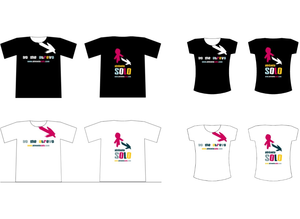
- Merchandising: boy and girl shirts.
- Integral design double bus.
- Design cards with dedication for the rooms of the daring.
Results:
-
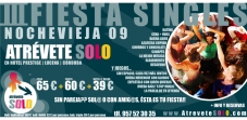
Naming: Dare Solo. Evoke decision, overcome shyness, print action. The clients are "daring", giving them a sense of group belonging, courage and bravery, reinforcing their purchase decision. It is a naming that moves away from the sector saturated with travel and singles, with creativity and its own personality.
-
Brand: the brand for the company "Atrévete Solo, S.A." it represents, both for its composition and for its color, the ideas and messages that are to be transmitted: adventure, surprise, emotion ...
It is composed of a symbol and logo, combined vertically and using the same corporate colors on both sides: bright, striking, warm colors that express youth and novelty.
The symbol is formed by two elements that represent an arrow pointing a direction, and a character without gender that follows that arrow. They are characterized by loose and thick strokes, by way of freehand drawing, that create a spot filled with color. This style gives the design great dynamism, vibration, movement, agitation, characteristics that define the concept of the company.
The logo, formed by the words "dare" and "solo", consists of two modern typographies, thick, and shocking. The word "only" has been used in capital letters, at a size larger than the word "dare", and playing with the different corporate colors to give it greater impact and freshness.
-
Color psychology: Orange (Pantone 123 C) combines the energy of red with the happiness of yellow. It is associated with joy, the bright sun and the tropics.
It represents enthusiasm, happiness, attraction, creativity, determination, success, encouragement and encouragement.
It is a very active and energetic color, which stimulates happiness and represents dawn, enthusiasm and creativity.
The vision of the orange color produces the sensation of greater oxygen supply to the brain, producing an invigorating effect and stimulation of mental activity.
It is a color that fits very well with young people, so it is highly recommended to communicate with them.
The citrus color is associated with healthy eating and appetite stimulation. It is very suitable to promote food products and toys.
It is the color of the fall of the leaf and of the harvest.
The orange color has a very high visibility, so it is very useful to capture attention and highlight the most remarkable aspects of a website.
It produces a sense of prestige. It means wisdom, clarity of ideas, and wealth. It often represents high quality.
Orange is a cheerful color, it releases negative emotions, it makes us feel less insecure, less painful, more understanding with the defects of others, it makes us want to forgive everything.
The orange stimulates the mind, renews the illusion in life and is the perfect antidepressant.
The keywords of the color orange are: energy, joy, happiness, attraction, creativity.
Fuchsia (Pantone Rubine Red C): Expresses naivety, kindness, tenderness, good feeling, absence of all evil.
It is an intense color, but less violent than red. The pink is the sweet side of the red color.
The pink is an emotionally relaxed color and influences the feelings making them kind, soft and deep.
It makes us feel affection, love and protection. It also takes us away from loneliness and makes us sensitive people.
Pink is associated with altruistic and true love
It is a poetic color par excellence, feminine almost completely and with universal meaning, that is, the meaning of this color is almost the same throughout the world and in all cultures.
Pink things are optimistic by nature. It is the color of candor and innocence, of charm and courtesy. It is also associated with illusions and miracles. It evokes sweet things and delight.
Pink is a creative color, the concept is transmitted with the same color.
It is also the color of spring when flowers begin to fill the fields.
The key words of the color pink are: innocence, love, total surrender, helping others.
Blue Pantone 309 C: Express confidence, corporatism, sincerity, intelligence, sincerity.
It transmits a sense of stability and clarity of purpose. Blue is usually associated with stability and depth.
It represents loyalty, wisdom, faith and truth.
It is considered a beneficial color for both the body and the mind. Slows metabolism and produces a calming effect. It is a color strongly linked to tranquility and calmness.
Blue is a cold color linked in that sense to intelligence and consciousness.
It is typically masculine, very well accepted by men, which balances the use of fuchsia, more feminine.
When used together with warm colors (yellow, orange), the mixture is usually striking. It may be advisable to produce impact, alteration.
The dark blue represents knowledge, integrity, seriousness and power.
It is a fresh, tranquilizing color and is associated with the mind, the most intellectual part of the mind, just like yellow.
The blue represents the night. It makes us feel relaxed and calm, like the immense and dark sea during the night.
It exerts like a strong sedative on the mind, allowing us to connect with our feminine and intuitive part.
Blue helps to control the mind, to have clarity of ideas and to be creative.
Keywords of the color blue: stability, depth, loyalty, trust, wisdom, intelligence, truth, eternity.
4. As a whole, the brand conveys the concept of "Cool & Fresh people"