Description:
Digital Marketing Consultant, specialized in marketing strategies for the online channel: corporate identity, web design, ecommerce, social media, SEO, online advertising ...
Goals:
-
Namig, name for the company and corporate identity design.
-
It must convey creativity, success, innovation. A brand of success and at the same time fun, where its members enjoy.
Result:
-
Short naming, easy readability and pronunciation, with .com domain available. It evokes success, creativity, while it is a close and fun brand.
-
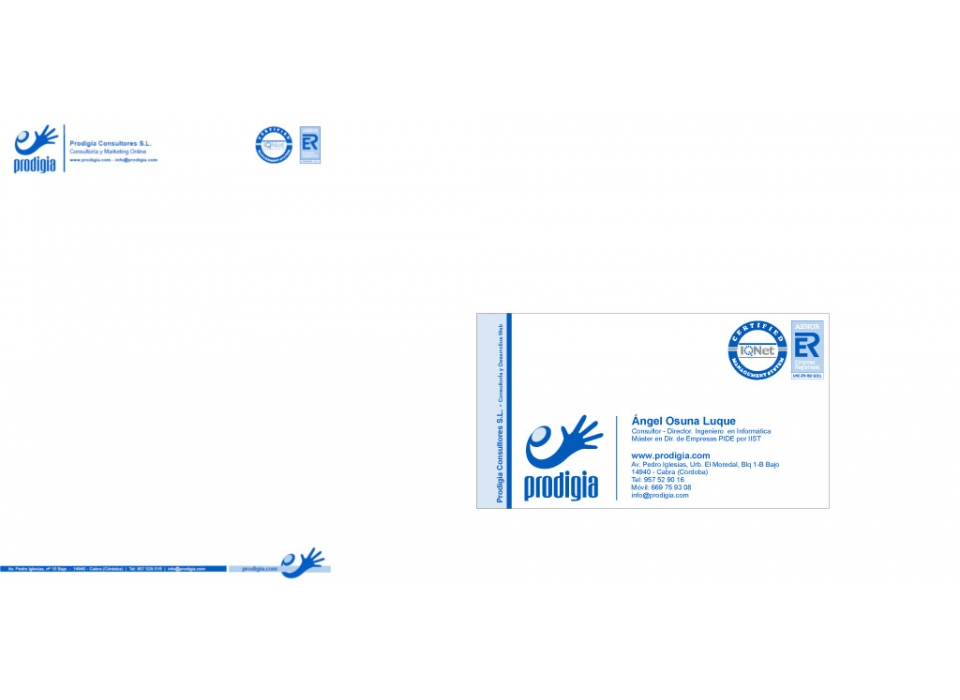
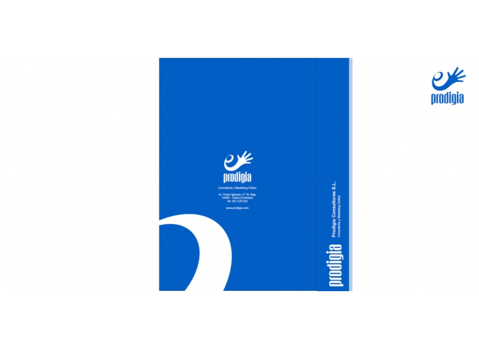
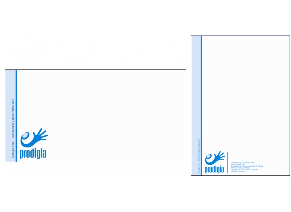
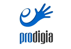
The brand created for the company represents the main ideas to be communicated: quality, solvency, guarantee, entity, innovation, trust, creativity, success. Composed by symbol and logo vertically, it combines blue and gray colors, colors that are quickly associated with the world of technology and business sector in which the company is located.
-
The symbol represents in a schematic way a hand that is directed to the client, to be narrowed in a way of trust and reliability. The hand approaches the client from left to right, in the direction of the reading, emerging from a circular morma in a spiral and ascending manner, thus re-enacting the concepts that are to be transmitted.
-
The logo, formed by the name of the brand "prodigy", uses the two corporate colors, differentiating two significant parts within the word, "pro" and "digia", thus granting double meaning. It has been used an elegant typography, rounded, thick and quite high characters, which is detached, full of strength and rotundity, is unmistakable and powerful, and easy to read.
