


Description:
Online casino project carried out at the request of a client, which finally did not complete the execution phase closing the company, the project being for sale. Web designed and animated also by Prodigia.
Goals:
-
Naming
-
Identity Manual.
Results:
-
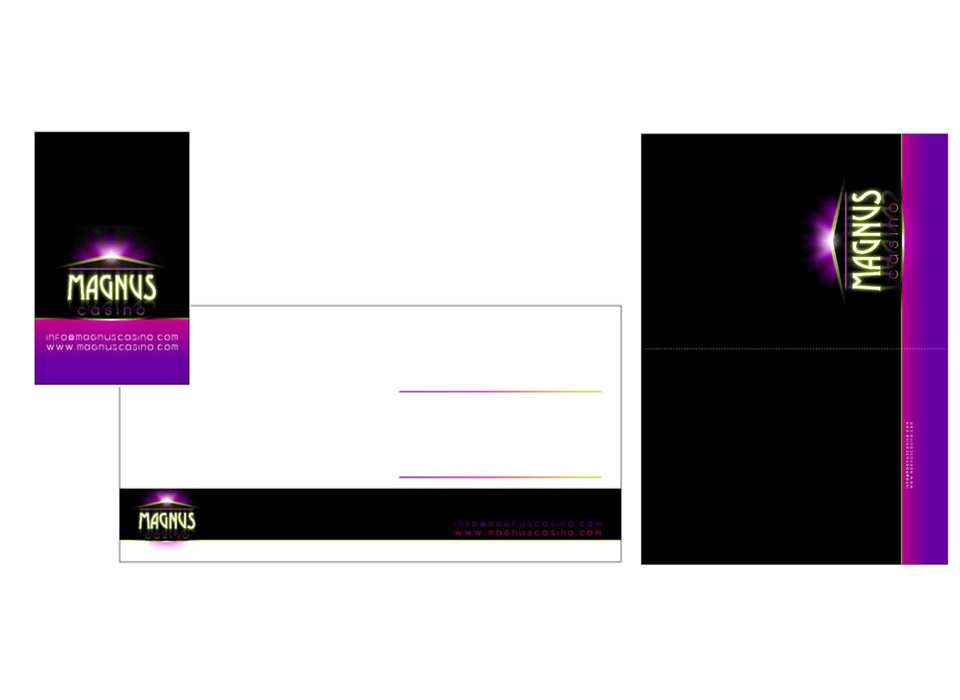
Naming: The brand chosen for online virtual casino is composed of the words "magnus" ("big" in Latin) and "casino". It is a brand that evokes greatness, elegance, classic style, easy to remember and pronounce in different languages.
-
Justification of the brand: The design of the corporate image for the online casino "Magnus casino" represents and symbolizes the main ideas that we wish to communicate: quality, efficiency, elegance, reliability, reliability, technology ... corporate image, composed of a symbol and logo, combines in a modern way the colors lime green, violet and white on black.
-
Justification of the symbol: The symbol represents a monumental or architectural volume, composed of several narrow simple forms, in the form of lines that draw the contours of a Roman-style building, a temple, in which the word "magnus" would form the facade of columns so characteristic of this type of architecture. The set of shapes, in lime green, is combined at the same time with effects of violet and purple lights, creating a nocturnal atmosphere of expectation, magestuosity, lights and spotlights, reminiscent of the great royal casinos of the most important cities. emblematic of the game.
-
Typographies: The logo, the textual part of the corporate image, "MAGNUS" and "casino", uses two completely different types to give contrast to the brand. The word "MAGNUS" uses a classic typography, thick, elongated, reminiscent of Roman culture, and that by its characteristics plays with the symbolism that has been given to this element (is the front of the temple, the set of columns where the building would be accessed). At the same time, a reflection effect has been created in the lower part of it to give it more spatiality and perspective. The word "casino" uses a more modern and modern typography, of dry stick, with simple and geometric shapes, of finer characters, that contrasts quite with the one used in the upper part. In this way, the logo plays with the ideas of tradition and modernity, classic and technology, elegance and current ...
-
Composition: The composition of the image is based on horizontal lines, at different levels, combining the textual part as forms that combine to create the total set of the image that represents a Roman style temple, with lighting effects , reflections, that creates a spectacular, mysterious, elegant, nocturno, luminous space ...