


Description:
Colonial, rustic, Provencal furniture factory. Bedrooms, living rooms, auxiliary. Web and digital catalog also designed by Prodigia.
Goals:
- Visual impact according to the company.
- Image, idea or message to communicate: Quality, comfort, furniture for your home.
Results:
Corporate identity manual:
-
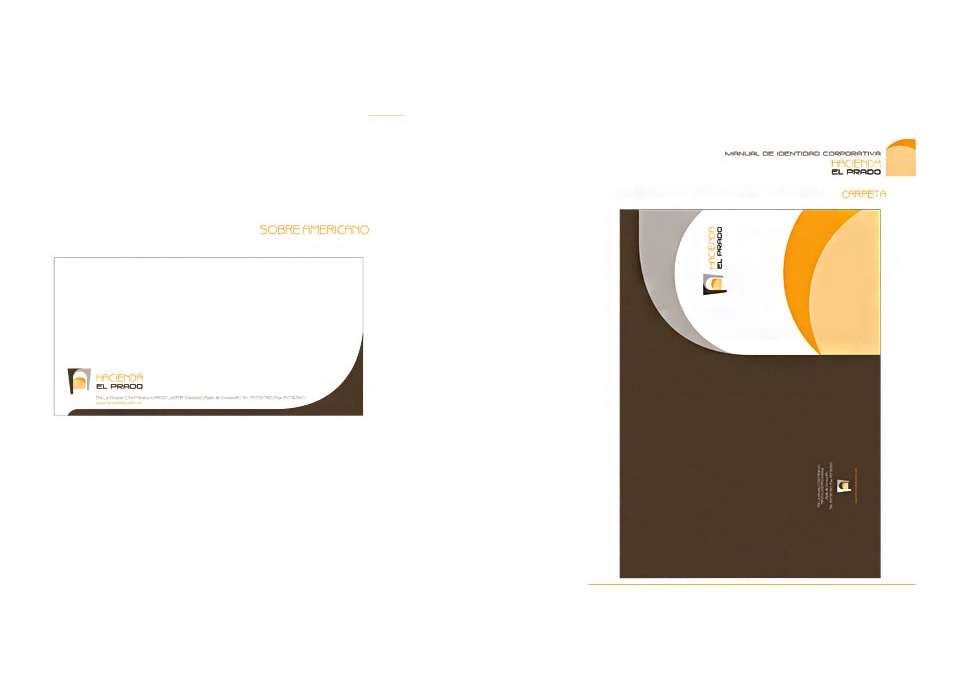
Symbol: formed by two sets of shapes that combine curved and straight lines in an elegant and sophisticated way. It highlights an arch as a frame or door, supported on two columns or legs at different levels (giving it depth), which encloses a form composed of two circles symbolizing an exterior landscape. In this way, the symbol represents at the same time a door through which a landscape can be seen in the distance, with curved and straight lines, thus granting modernity, design and innovation.
-
Logo: the textual part of the corporate image, using typographies that play with curved and straight strokes remembering the shapes of the symbol and thus combining perfectly with it.
A typography of fine lines and curves has been used for the word "hacienda", which is distinguished by elongated, tall, broad characters that resemble the symbol forms (the letter "A" reminds of the bow drawn in brown) . For the words "the meadow" a more square and thick typography has been used, with more flattened characters that combine curved and straight lines, giving it more strength and weight to close the mark.
The two types can be considered modern, current, of great clarity and simplicity, easily readable and with great visual impact. The logo can be easily read in different sizes, both large and small (a minimum size is recommended for its correct visualization)
-
Brand: The redesign of the corporate image for the muelbes factory "Hacienda El Prado", represents and symbolizes the main ideas that we wish to communicate: quality, elegance, comfort, innovation. This company is characterized by the manufacture of colonial, rustic, Provencal furniture, for all types of home stays, such as living rooms, bedrooms, etc.
The composition of the image is based on horizontal lines, extending the text widely, which gives stability and weight, and combines vertical lines in the symbol complementing and contrasting the image, thus gaining impact and elegance.
It is an image easy to remember, impressive and of great elegance and modernity. Remember real and symbolic images, so it is easier to visualize.
-
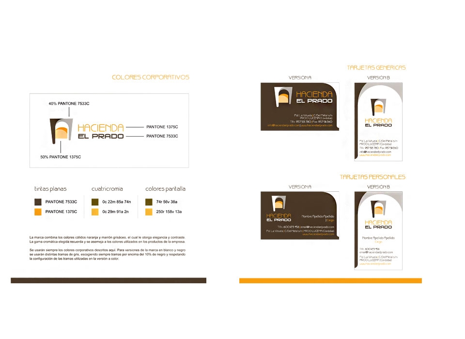
Color psychology: the brand combines the warm colors of orange and grayish brown, which gives it elegance and contrast. The chromatic range chosen recalls and resembles the colors used in the company's products.
The corporate colors will always be used. For black and white versions of the brand, different gray patterns will be used, always choosing frames above 10% black and respecting the configuration of the frames used in the color version.