


Description:
Construction Systems Faimar, s.l. Construction company. It uses an Austrian construction method.
Goals:
-
Corporate identity.
-
Communicate company image and capacity of action to potential clients Promoters.
-
Image, idea or message to communicate: Seriousness, professionalism, compliance with deadlines, capacity, accredited equipment.
Results:
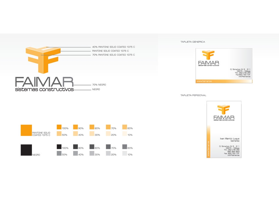
Corporate identity manual:
-
Symbol: represents a volumetric form, in perspective, composed by the letter "F" repeated in 3 different angles and positions, making reference to the initial of the "Faimar" brand. Composed of straight lines shapes, with different shades of orange, creating contrast of lights and shadows that add depth and dimension to the brand, together with the attributes of solidity, stability and robustness.
-
Logo: the textual part of the brand is composed of two distinct typographies and with a sober style that brings distinction and accuracy to the corporate image of the company.
For the word "FAIMAR" a typography of straight and thick lines has been chosen, which contributes to the brand forcefulness, firmness, besides being a typography of easy readability, and therefore with a greater degree of retentiveness for the human eye. On the other hand, for palagras "constructive systems", a typography of curved and more rounded lines has been chosen.
To make a contrast to the logo, a distinction has also been made between the first part of the logo, which refers to the name of the company, for which the text has been used in capital letters and larger, thus acquiring greater importance within the logo , and the second part, which is relative to the activity of the company, for which the text has been used in lower case.
-
Brand: it symbolizes the main ideas that you want to express, such as innovation, quality, solidity, stability and robustness. Composed by symbol and logo, the brand combines orange and black colors, with different nuances of both.
The brand combines rectra lines and curves, in a set that combines colors that are quickly associated with the world of construction, such as gray concrete, combined with orange, which complements it and gives visual impact and attention.
The brand as a whole fits perfectly to the image of the company, its activity and the construction sector.